This is documentation of my process, insights, and findings in exploring an anime look in Blender. Though not a tutorial in itself, I link to every resource and guide I found useful.
Overview
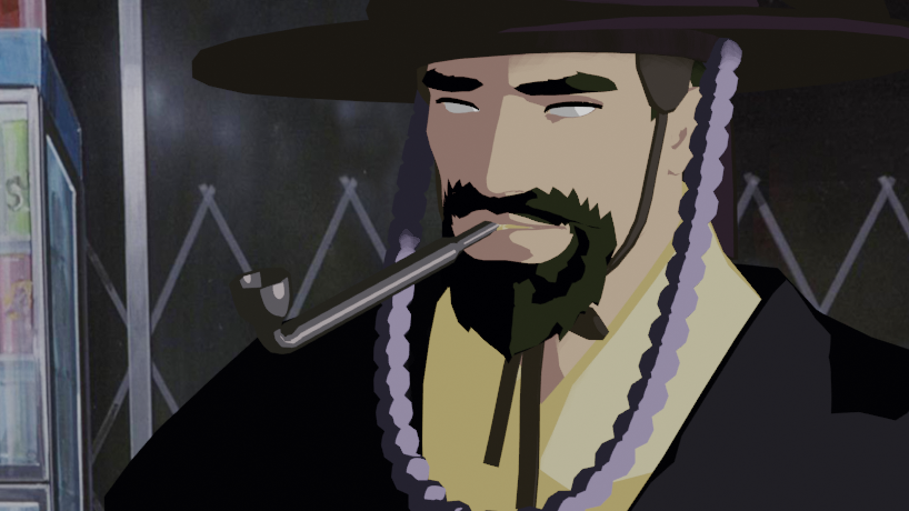
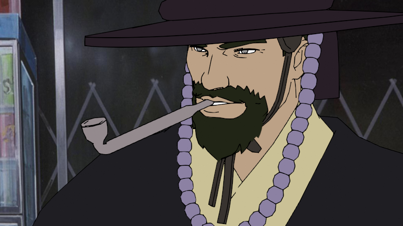
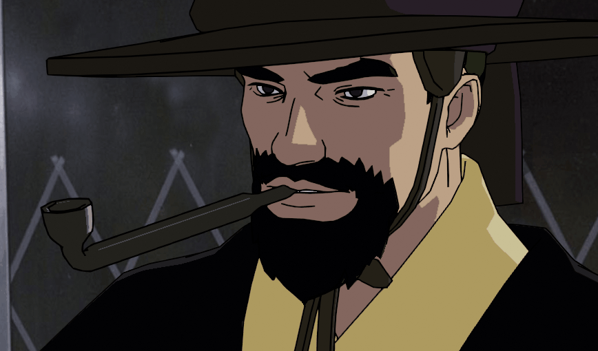
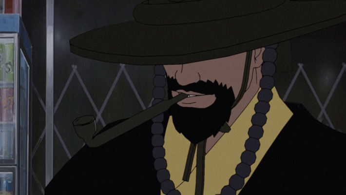
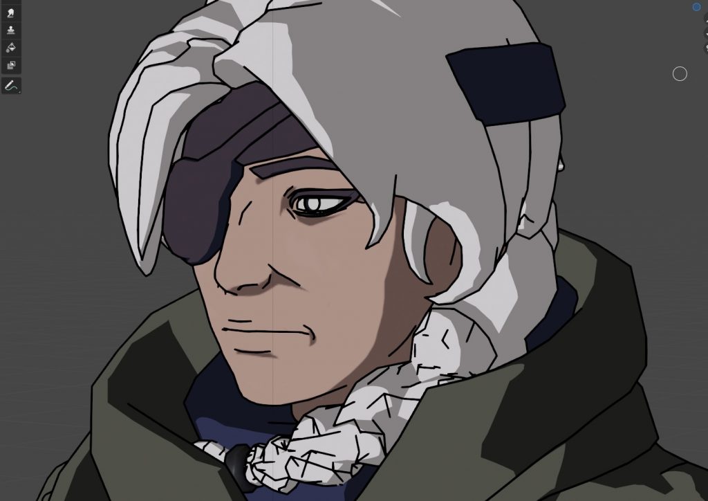
The final product, using a borrowed 3D model and background image.
Contents + Links
Part 1: Normals & Lineart
- Goals & References
- Colouring & Prep
- Tutorial: [Toon Shader by Royal Skies]
- Linework
- Tutorial: [Grease pencil Line Art by SouthernShotty]
- Normal Editing
- Tool: [BNPR Abnormal] , [Video by Royal Skies]
- Theory: [How and why edit normals by BK Kame]
- Theory/Tutorial: [Normal editing 101 by Activemotionpictures]
- Animation & Post-Processing
Part 2: Distance Fields
- Goals
- Understanding distance fields and making the texture
- Creating a node setup and expanding shading
- Conclusions
Part 1: Normals & Lineart
1. Goals and References
My goal was to understand producing cel-shaded-like shading using normals and explore line art. Knowing this, I cut corners in other areas to reduce overhead and avoid being distracted by other elements.
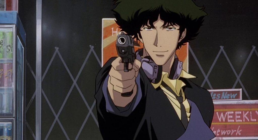
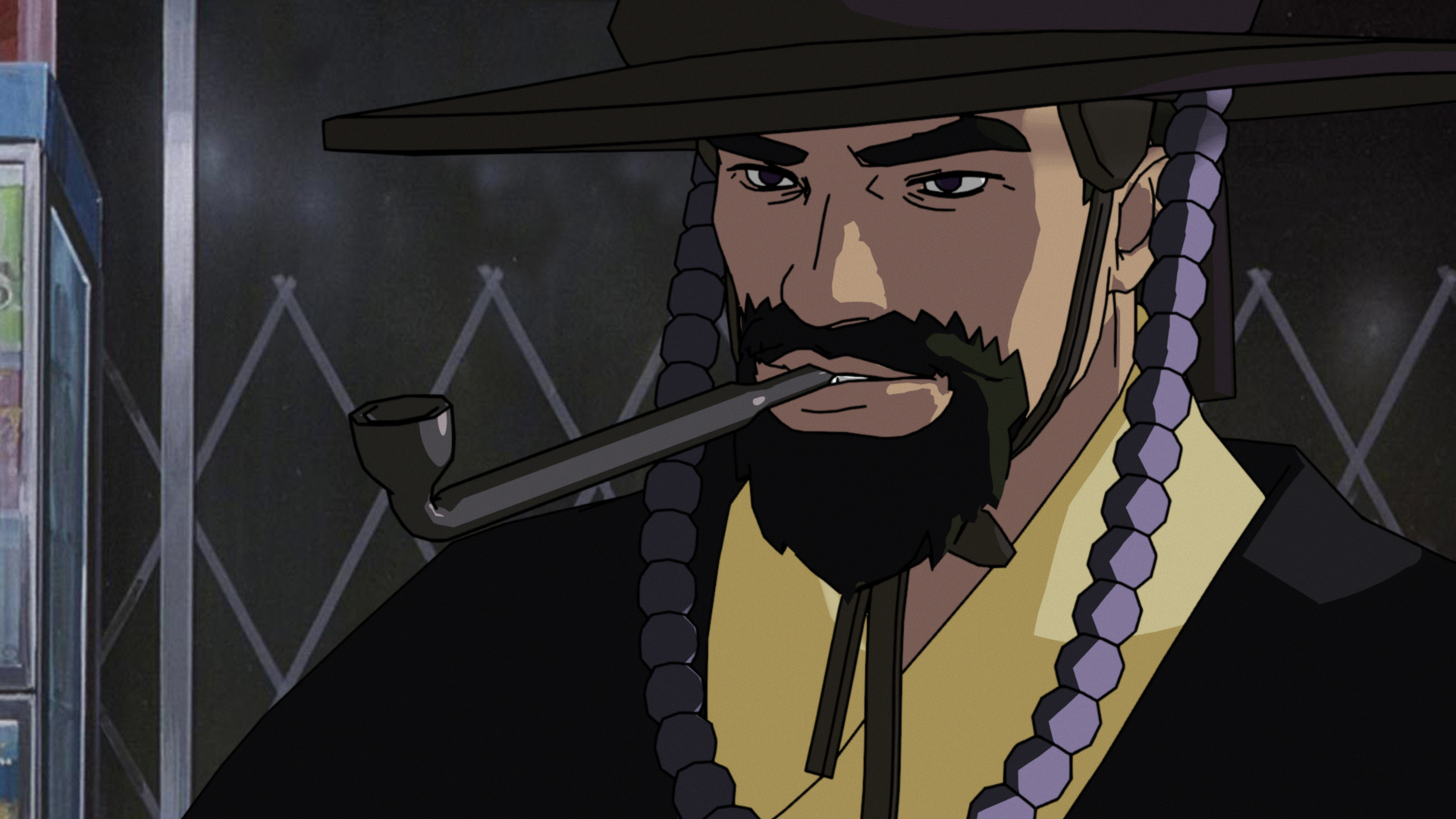
To avoid colour theory and tone, I used a screencap from Cowboy Bebop to reference the exact colours used, and to use the background.
To avoid character sculpting, I used a model from Overwatch, a model with an intended visual that's completely different than what I'm aiming for.
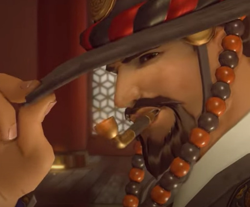
Being a test of achieving a specific look, references are mandatory. My chosen reflected the specificity of what I wanted to achieve: a heavy hand in face shading with a clear form or clear shadow shapes, determined by artistic decision and not necessarily by realism. Examples were from 80s anime (heavily shaded), and high-production anime (more delicate, deliberate, and detailed in face lighting).
2. Colouring & Prep
Tutorial used: Material Based Anime Shading by Royal Skies
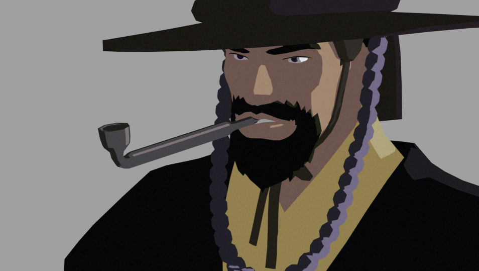
Toon shader applied to all materials, with colours picked from my reference screenshot
Simple half-sphere for the pupils. Having a pupil as a separate mesh allowed for fine control which turned out useful later on
3. Linework
Tutorial used: Grease Pencil Line Art Tutorial by SouthernShotty
The commonly used Inverted Hull method was too uncontrollable and relied on deforming meshes in specific ways for enough depth for contour lines to appear. Not only that, but overlapping objects created unexpected line inconsistencies. I haven't figured out how to make this work and it didn't seem worth it when I found out about the grease pencil method.

My initial test with the Inverted Hull method. Notice the broken lines.
With the grease pencil method, my contours had a consistent line-weight and expected results. I can imagine turning these into strokes and scaling vertices to create line-weight variation.
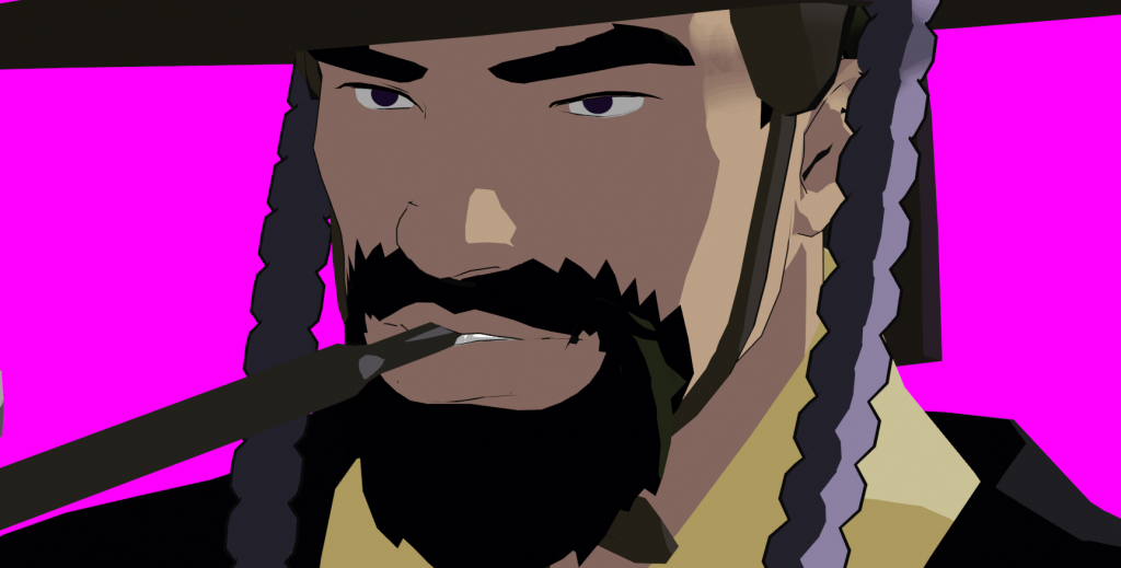
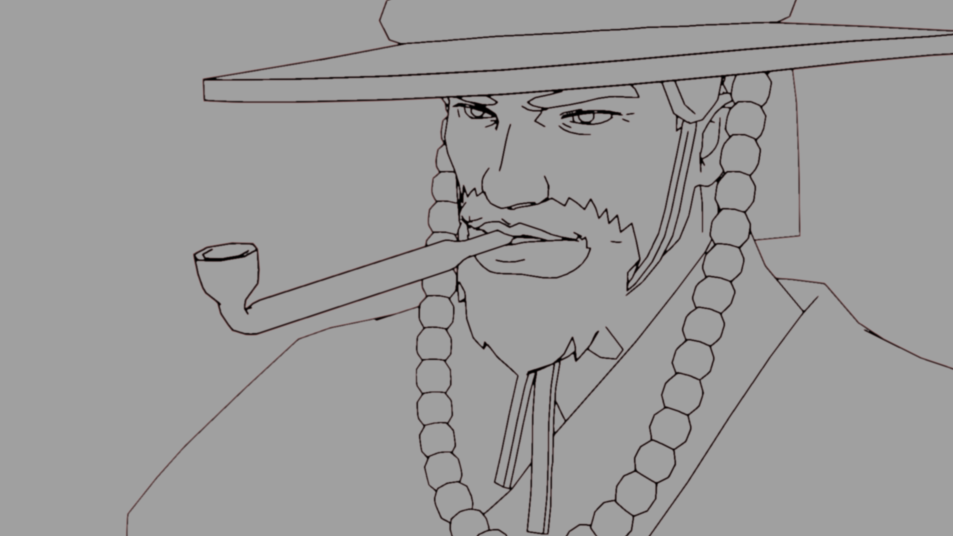
Grease pencil line art which picks up on contours as well as material changes and intersections
The real benefit was being able to add detail lines onto the mesh using 'Edge Marks'. These Edge Marks are set by 'marking edges' on the mesh, similar to 'mark sharp'. These lines sit on top of the mesh and thus, are properly obstructed by mesh volumes. These lines can be achieved by texturing the model with an image with detailed lines, but I find that process inconvenient.
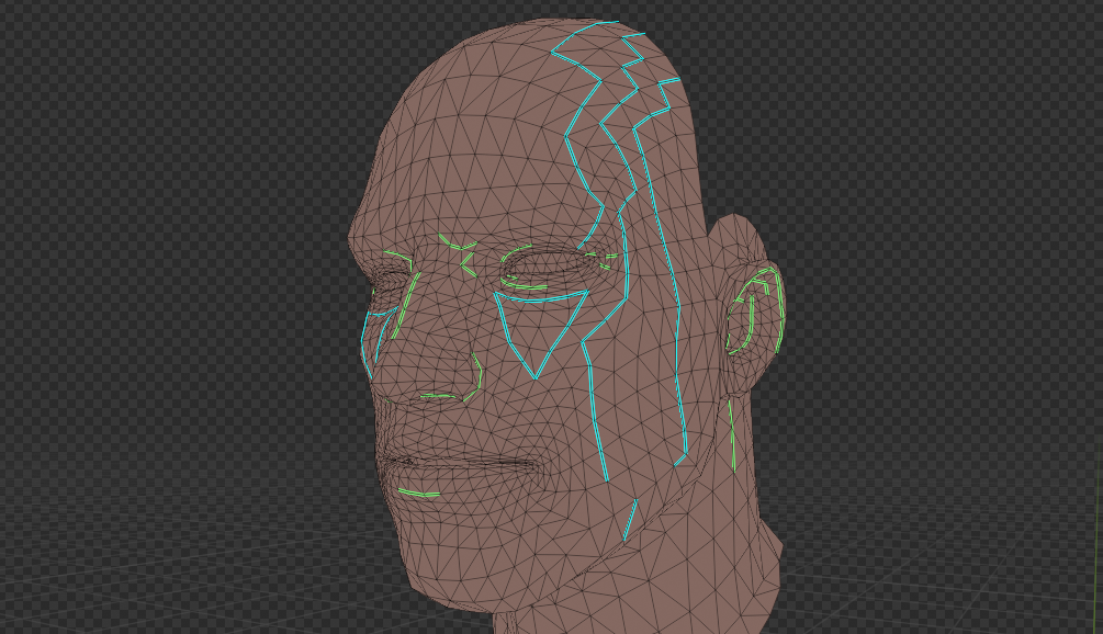
Line Art with Edge Marks
Edge Marks I had added in
Distinct to selling the mature anime look are these selective artist-informed details — eye lids, bottom lip, ear details. I also used Edge Marks to bring definition to the beads, hat, and pipe, which were not at steep enough angles to be generated by contours.
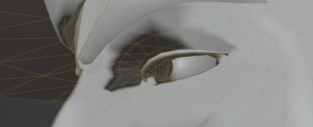
4. Normal Editing
Tool used: BNPR Abnormal Plugin, Setup and detail video by Royal Skies
Theory: BK Kame's video explains why and how you edit normals
Process/Theory: Normal Editing 101
A quick rundown of what editing normals does in this context, is customizing the direction a face will catch and bounce light. By controlling this, we can make groups of faces catch light at the same time to create controlled shadow shapes.
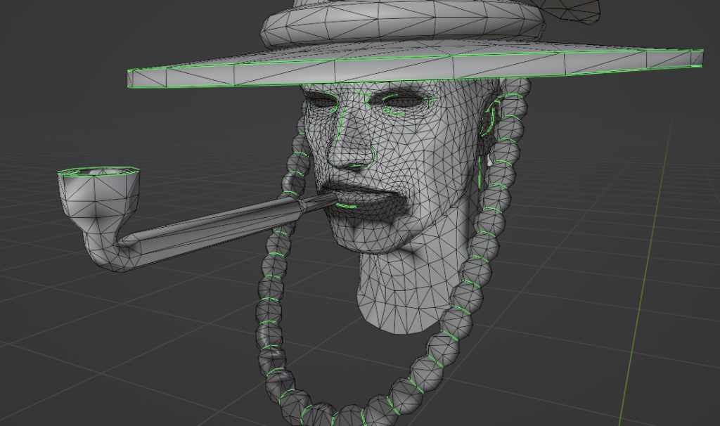
Video demonstrating on how the normals affect lighting, before and after editing.
My first attempt was a mess, and that's because I was trying to figure out the shadows as I went along the mesh.
To start fresh, I used a proxy mesh via this and this tutorial by Royal Skies. This method uses normals from the proxy to determine the normals of the final mesh. Unlike the tutorials which had a softer look, I preferred a blocky proxy mesh to create clear divisions on the face. Although I don't think the proxy mesh helped that much technically, I now understood what I was doing. I needed to adjust normals in larger groups, and there needs to be a consistency in where they faced.
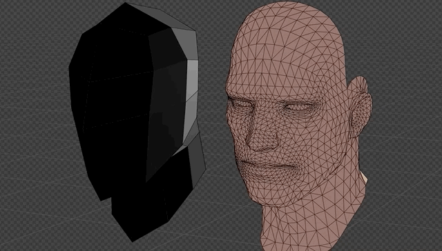
Left: My proxy mesh, Right: Proxy mesh data transferred
My biggest takeaway is: The way light will shade the face needs to be planned at the very beginning, and the mesh topology needs accommodate those shapes. My method for planning at this point was using Mark Sharp (in blue) to mark the shadows on the mesh. I saw this very helpful video by Activemotionpictures after I finished, which talks about planning ahead.
I didn't want to mess with the meshes too much but I DID want to hack together a cheek triangle (yellow) and a nose highlight (red) which I felt were important for the look. I rearranged the mesh a bit to get me close enough to the effect.

There are a few areas I wanted permanently dark. This included the inside of the ear, the inner corners of the eyelid, the underside of the nose, and the bottom of the lip.
At this point, I felt to achieve my desired look would require a lot of mesh adjustments which I didn't want to mess around with. I felt I learned what I set out to learn, even though the normals on all the props and faces aren't perfect.
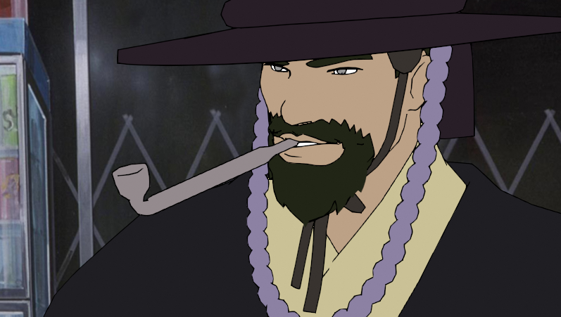
5. Animation & Post-Processing
My post-processing set out to imitate slightly degraded anime dvd rips, by studying the Cowboy Bebop reference I initially used.
Line art is made rougher using a 'simple choker', with a small red-tinted blur to give the linework some haziness
Colour is slightly blurred so the edges of shadow aren't as harsh, and there is 'match grain' to create grain according to the reference
The animation was extremely simple, and animated on 3s at 24fps. The rule of thumb was 2-3 poses per keypose. To add a little more length, I slapped on a voice clip or two and animated a simple mouth movement.
Part 2: Distance Fields
1. Goals
My goal this round is understanding what SDF/Distance Fields are and to explore how this can work for anime shading. I got this idea from this twitter thread by madumpa which tech artist Joyrok had showed me.
2. Understanding Distance Fields
Theory: Distance Fields (Part 1) by PrismaticaDev
Theory: Glyphs, shapes, fonts, signed distance fields by Martin Donald
Theory: What are SDFs Anyway? by Joyrok
This video by Prismaticadev helped me understand a distance field creates a gradient, which has values of black to white determined by its proximity to another object. This information can be used as a mask for other effects. So the closer your DF is to another mesh, the more white it is.
This video by Martin Donald and article by Joyrok helped me understand how these distance fields work on a 2D textures using "Signed" Distance Fields (SDFs). You can adjust a threshold to create a clear black and white on the texture. You can also use R G and B layers for different images.
I created a simple distance field texture to prove this out in Blender with a ColorRamp on constant to clamp the values
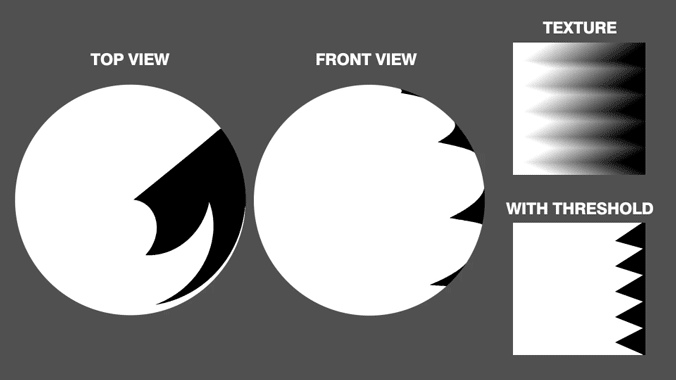
A zig-zag distance field on a simple ball mesh
Moving onto a mesh (another Overwatch mesh), I painted several textures at different lighting angles using Blender's Texture Paint interface.
Painting a rough idea of lighting
Results of painting 3 angles of lighting
These are combined into a single gradated texture at 33% each, and put back on the mesh. You could likely blur these together for a smoother transition but I like the control of the snapping shadows.
Making the material and testing these three textures
Creating both a texture for vertical lighting, and combining them
It is now I realize how much I didn't understand how I wanted the anime lighting to look. This method requires you to really know what you want to paint.
3. Creating a node setup and expanding shading
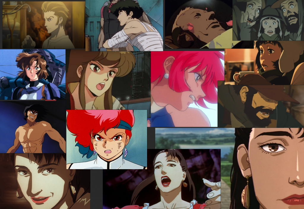
To create something more realized, I collected several references to figure out how I wanted to approach these shapes. There's some obvious rescency bias in the screenshots. Going into the texture paint and carving out these shapes proved to be more difficult than I expected
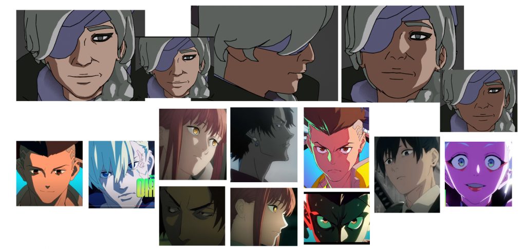
Top: The final painted textures on the model. Bottom: My lighting references
The hardest one to figure out was the half-way lighting for a profile view. So often in anime, profile views have a rim lighting along the face.
Instead of bringing all my individual textures out of Blender to compile into a gradated texture, I created a node system that would layer each texture on top of one another using a cascade of mixRGB nodes. This meant every time I painted a texture, I could see how it'd look in-context moving through the gradated texture. IT also means, if I want to include an extra texture at the end or in-between certain textures, I could do it live and all within Blender.
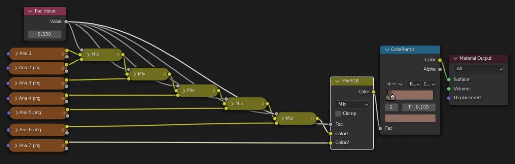
Node setup for in-Blender preview
In this final result, you can see there are harsh breaks in the transitions that are caused by subtle differences in the textures. For example, the shadow on her chin builds very jaggedy because every texture I painted that that area painted in on a slightly different spot.
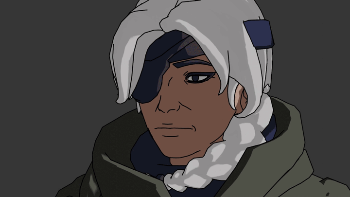
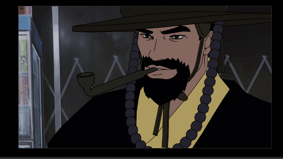
Final result
4. Conclusions & Takeaways
A summary of achieving the cel-shaded look with distance fields in comparison to normal editing.
✅ Does not rely on meshes. Easy to apply this method on any sort of mesh and forgiving to those unwilling to deal with meshes or topology.
✅ High control over results. Complex shapes are as complicated as painting them in.
❌ Not real lighting. It has no proper reaction to light, so doing things like multiple lighting sources, or a lighting source you didn't account for, would require a more complex node set-up.
❌ Time-consuming to make changes. Making big changes across multiple textures requires a lot of back-and-forth painting that can end up being very time consuming for small changes.
Final Thoughts
I have to admit, I gave up on this early because I was really not enjoying the method and the results.
I wouldn't use this for my main method of 3D character cel-shading. It feels like painting my lighting onto the model which, although gives a high degree of control, is very inflexible. I can see myself using this for less important items like accessories, or even hair if I want lots of control. Perhaps even combining both methods! Normal editing for the shadow, and this gradated texture for maybe special lighting or effects.
However, for those who are reluctant or unable to learn how to deal with normals, this could be a potential solution, especially if the shapes are relatively simple.
